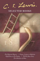
I must admit – there are times when I pick books up purely for its aesthetic qualities - covert art, title design and its acid-free pages. Unfortunately, most Christian publishers like Word, Moody, Banner of Truth, IVP and Multnomah are not well-known for their brilliant book covers. I hope this will change after HarperCollins took over Nashville - based publisher Thomas Nelson. Their edition of C.S. Lewis' classics and favorites are all beautifully designed and perfect when arranged in a single row.
 |
My C.S. Lewis collection holds a special place in my tiny bookshelf and I
am determined to replace the Touchstone editions with HarperCollins
|
 |
| Nothing beats the Hardcourt design - A sure winner of Best Spine of the Year Award! |
 |
| This is my favorite John R.W. Stott book. Unfortunately, the cover is just plain ugly. |
 |
| The old edition of Tozer's books are all uniformly designed -- with powerful typography. |
 |
| Books with gold medals are always irresistible specially if it is placed on the spine. |
Well, you can’t judge a book by its cover, but people always do.


No comments:
Post a Comment